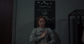
- Themes of centring
- Crowding around the centre to the sides
- Crowds
- Claustraphobia
- Motion (dancing within the film)
- Witchcraft
- Femininity
as seen in
But let’s get back to the new film. The peculiar S from Dan Perri’s logo becomes a reference point throughout Suspiria’s marketing campaign. It brands this series of brooding teaser images, which treat the film’s settings as actual characters. This unusual approach foreshadows how the architecture of the locale plays an essential role in the story, to the point that it almost becomes a sentient creature.
https://www.typenetwork.com/news/article/screenfonts-january-2019
Generating a font
Based on Maldonado's approach to creating form from image, I used tracing paper over the screencaps to record forms, spacial understanding, and then highlight the emotions that need to be captured within the typeface.
First I began by placing tracing paper over the screencap. The screencaps are dark, and the tracing paper is quite opaque which made it difficult to see the image but this allowed me to illustrate the most important forms that stand out, and allow me to try not to be as exact to the form depicted in the image and instead capture a shape that can be used within my type development.
The shapes conveyed a sense of disjointedness; the important forms were only depicted partially due to the strong chiaroscuro. There were many organic shapes that clashed with the general angle of the screencap - the sharp, centred perspective. This is a running theme throughout the whole of the Suspiria film that was also reflected in their advertising.
I then used the same tracing paper to capture the forms within the next screencap to create layers of information to work on.
The initial idea of the font is not too different to the already existing 2018 Suspiria font, however I highlight the feeling of disjointedness that I responded to the most throughout analysing the screencaps and the illustrations. I explored the idea of organic bold shapes clashing with angular, thin-weighted strokes. I did not focus on legibility, especially when illustrating the "r" glyph as even with the screencap and within the film, understanding all details and following the storyline clearly is not precedented. The movie focuses on emotional expressions, movement and music which I feel I am beginning to explore.


No comments:
Post a Comment